a wing of the museum · 一枚のできるまで
How a Card Is Made
一枚のできるまで — the design flow, the press, the inspection
Every card in this house began as an empty slot in somebody's spreadsheet, crossed years of design, a printing line, and an inspection belt, and only then reached a pack. This wing walks that whole line — including the rooms the publishers keep dark, which we name as dark instead of guessing at, and the inspection's famous escapes, which the hobby decided were treasures. We're a card shop, not scholars: every claim is hedged to its evidence, and the sources hang at the foot.
刷ったら直せない
suttara naosenai — Printed Means Unpatchable
A trading card is software that cannot be patched. Once the sheet leaves the press, every number on it is permanent — which is why everything in this wing exists: the years of design before the file locks, the industrial choreography of stock and ink and foil, the inspection lines at the end, and the strange afterlife in which the inspection's escapes become the most valuable objects in the hobby. This wing walks that whole line, from a spreadsheet of empty slots to a sealed pack to a grader's slab. Two warnings before the tour. First: the light is uneven. One publisher narrates its own process weekly; others document theirs only through job advertisements and apology notices — and where a room is dark, we say the room is dark rather than describing furniture we cannot see. Second: we're a card shop, not scholars. Every claim here is hedged to exactly the evidence we hold, the sources hang at the foot of the page, and the claims our own refuters killed did not make it in.
第一部 · 企画
part one — the design flow
骨組み
honegumi — The Skeleton
The genre's one floodlit design room is at Wizards of the Coast, which has narrated its own process weekly since 2002 through Mark Rosewater's Making Magic column. The documented pipeline runs roughly twenty months per set through four named stages — exploratory design ("gather information for the house you'll build"), vision design ("a metaphorical architect, drawing the blueprints"), set design ("build the house"), and play design, the balance team created in June 2017 to be present "from the very start of the process to the very end." The names date from October 2017; before that the same work was called design and development, so the date on any process article matters. A set begins not as cards but as a spreadsheet of coded empty slots — CW01 is "common white, slot one," typically a one-mana creature — with quota defaults published to the digit: 101 commons, 80 uncommons, colour-by-colour creature percentages from white's 62% down to blue's 50%. Rarity itself is a design tool with a stated theory: the 2011 "New World Order" doctrine rations complexity at common because beginners open mostly commons. And since the Strixhaven era Wizards has done something almost no industry does: published its actual internal vision-design handoff documents, margin commentary and all. When the file locks — roughly six to eight months before release, by the designers' own accounts — the cards go to the presses, and design's remaining instrument is the one this wing ends on: the list.
絵の門
e no mon — The Art Gates
At Creatures Inc., which has designed the Pokémon card since 1996, the documented flow is the art pipeline. A commission arrives — sometimes with Creatures' own rough concept sketch attached — and then passes three gates: rough, pencil line art, digital colour, each discussed and approved in turn. Mitsuhiro Arita, who has painted over five hundred cards since the first set, puts the span from order to delivery at about two months; the authorized roster was about eighty illustrators in early 2019 and reported above one hundred and fifty by the 25th anniversary, with the public Illustration Contest serving, by the project manager's own account, as a recruiting funnel. The matching is deliberate: assignments go to "the artist who can draw that Pokémon with the most charm," and when a much-printed Pokémon starts looking samey, new hands are rotated in on purpose. Set planning starts from the video games' world, picks four or five headline Pokémon, then balances types, evolution lines, popularity, and mechanics (director Atsushi Nagashima, on record in 2020); card effects are designed from two directions — the Pokémon's image first, or a needed deck role first — with a full-time playtest team, profiled as knowing thousands of cards perfectly, requesting blunt HP-and-damage tweaks. What ships abroad is a recomposition, not a translation: the English Surging Sparks (2024) merges two Japanese expansions, the Stellar Tera starter sets, and a handful of promos into one 252-card product. The scale downstream of these gates: more than 85 billion cards in sixteen languages by March 2026, roughly ten billion of them in the final year — and it still was not enough, which is a later plate's story.
半灯の部屋
hantō no heya — The Half-Lit Rooms
Then there are the publishers who don't narrate. What is known about One Piece Card Game's design comes from Bandai Namco's own investor report, where producer Kohei Goto describes roughly two years from planning to the July 2022 launch, built global-first, with a doctrine of not leaning on the IP — the game had to stand on its own as a card game (our rendering of the Japanese) — and from a small external studio's own works page: Next Play Inc., founded April 2022, three months before the game launched, credits itself with OPCG's "game rule development, card list creation, and operations support," its representative introduced at ONE PIECE DAY '23 as the game's main designer. The market leader by Guinness count is darker still: Konami publishes no design narrative for the paper game at all, and its most concrete public statements are job postings — a card-planner role described as per-card effect verification and rules maintenance, and a production-engineering role whose actual text covers evaluating and improving products manufactured in Japan and overseas (our rendering of the Japanese), plus factory development and audits, with Chinese (HSK 5 or above) preferred. A job advertisement as the only window into a 25-billion-card supply chain. The strangest part is that the disclosure line runs through the middle of one company: Bandai's own Union Arena publishes signed producer letters — design goals, lessons from teaching sessions, even a box downsizing explained — while its sibling One Piece game publishes none. Where the design rooms are half-lit, we report the half-light.
顔と背中
kao to senaka — The Face and the Back
The card face is a designed machine, and it gets patched like one. Magic's face has had three generations — 1993, 2003, 2014 — and the 2003 redesign is documented down to its reasoning: a title font "selected for its ability to be read from far away," bigger text boxes that could finally hold cards "we couldn't print before." It also shipped a real bug — white and artifact frames nearly indistinguishable — patched by darkening artifacts the following year, a story Wizards told on its own site (the archived version adds the best detail: the frames had been evaluated side-by-side, but players fan cards and see only the tops). The 2014 frame hides the wing's favourite secret in plain sight: the black bar under every text box exists, in the design director's words, to make cards "machine-readable by recognition software at our production plants" and eliminate packaging errors — a stripe of ink for the machines, on every card, that almost nobody notices. Rarity marking is younger than it feels: Magic printed for five years with no on-card rarity at all (colour-coded symbols arrived in 1998); Pokémon's shapes and One Piece's letters are colour-independent by construction, though no publisher documents accessibility as the intent. And the back is the strictest design brief in the hobby: it may never change, because any difference makes marked cards. Wizards has documented three near-misses — a planned expansion-specific back killed when someone realised deck ratios would leak draw information, a trademark symbol that nearly split the pool in 2001–02, and a recurring internal debate that status quo always wins — which is why every Magic back still carries the fossil of "Deckmaster," an umbrella brand abandoned decades ago, and why a German first-edition Growlithe misprinted with a Magic back is physical proof the two games once shared a press. When Pokémon's international cards dropped their yellow borders in 2023, the stated reason was one worldwide card design — the layout finally following the localization.
直しの通り道
naoshi no tōrimichi — The Error-Correction Channel
Because the paper cannot be patched, the fix arrives later, as a list. Magic documents this loop most completely — including its failures. After a rough Standard year, Wizards created the dedicated Play Design team (June 2017); two years later that team failed in public and wrote it up the same day: the announcement banning Oko cited hard numbers (almost 70% of decks at the championship, a 53% non-mirror win rate), and the Play Design lead's post-mortem admitted the card had been broken by late-stage redesign — "we lost sight of the sheer, raw power of the card, and overshot it by no small margin." Digital play then accelerated the loop: by 2020, ban announcements quoted Arena ladder percentages and said outright that the metagame now develops too fast to wait for rotation; that June, Wizards nerfed an entire mechanic by rules change rather than ban ten cards; by the end of 2021, its digital-only format patched card text continuously between sets. The other publishers run the same loop at different transparencies. Konami keeps two clocks for one game — the Japanese list on a standing modern cadence (quarterly in recent years, with off-cycle exceptions), the international list moving irregularly — and neither official page has ever printed a word of reasoning; the silence is the finding. The youngest publisher is the plainest-spoken: One Piece Card Game's official notices state the cadence (normally twice yearly, pegged to Japan's Championship Season 1 and Worlds), give reasons ("game times have become significantly longer than expected"), and in 2026 introduced the most surgical instrument any of the four uses — a banned pair, two cards individually legal but forbidden to share a deck. Pokémon, for its part, currently bans nothing at all in Standard and keeps a standing errata document. Design never really ends; it just changes instruments.
第二部 · 印刷
part two — the press
紙の中身
kami no nakami — The Filling in the Sandwich
A trading card is a laminated sandwich, and the filling is the security feature. A genuine Pokémon card is white-black-white — an opaque black core visible at the cut edge — and Japanese collector guides preserve a detail the English scene rarely mentions: the black layer's design purpose is to stop the card back showing through during play; foiling counterfeiters is the happy byproduct. Magic's filling is blue, tinting the card dark under strong light — kept, by community account, for product continuity even though modern black core is more opaque — and some Japanese-printed Magic cards have a purple core instead, reportedly because purple stock recycles more readily under Japanese law: a regulation, fossilised in cardboard, now used by collectors as a factory tell. Here is the honest frame for everything in this part: nowhere we could find has any publisher published its card construction — not the layers, not the paper weight, not the coating. The famous light test, the rip test, the ~1.7–1.8 grams a Magic card weighs — all of it is collector-codified, reverse-engineered from how the object behaves rather than issued as a spec. The physical specification of the world's most-traded collectible is, officially, a blank page; the cards themselves are the only document.
誰が刷るのか
dare ga suru no ka — Who Prints the Cards
Ask who physically prints the cards and the industry splits into the documented and the unsayable. Documented: Cartamundi's own website is headlined "Magic the Gathering Cards produced by Cartamundi North America" and tells the story as marketing — approached by Garfield and Adkison in 1992, Alpha printed at Turnhout, Belgium in 1993, over a billion cards by the end of 1994 — a rare case of a printer publicly claiming its client. It is also why a Magic card is 63×88mm: the first printer was a European playing-card house, and the genre inherited its sheet. Documented, by acquisition: The Pokémon Company International simply bought its printer — Millennium Print Group of North Carolina, partner since 2015, which it agreed to buy in April 2022 — and in December 2025 that printer signed what trade press reported as the largest US manufacturing lease of the year, 1.27 million square feet, for printing Pokémon cards. Japan is the unsayable half. TOPPAN advertises "Japan's largest TCG manufacturing facilities," in the business since 1999, anti-counterfeiting drawn from its securities and ID-card printing and all — and then states, in writing, that its contracts forbid naming a single client. The claim that DNP prints Yu-Gi-Oh! traces to a forum answer; the claim that TOPPAN prints Pokémon is plausible and confirmed by no one; Konami's closest public statement is a job posting for production engineers who evaluate and improve products manufactured in Japan and overseas (our rendering of the Japanese) and audit factories. In this industry, printer identity surfaces only sideways — an acquisition press release, a printer's own brochure, legal text on old packaging, a job ad — never as a credit on the product. Even the loveliest proof is an accident: in 1995–96 Wizards quietly test-printed Fourth Edition in the US with the United States Playing Card Company — the Bicycle people — and the leaked cards were caught years later partly by their wrong core. The filling betrayed the factory.
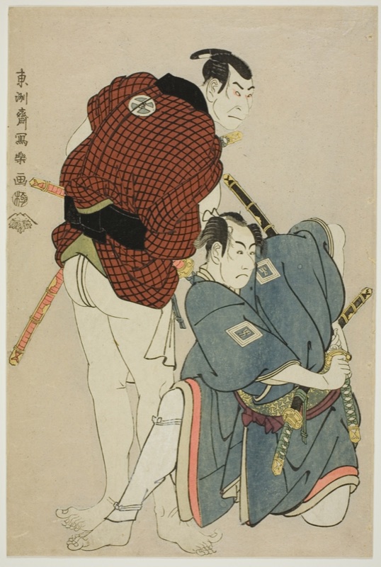
Clarence Buckingham Collection — The Art Institute of Chicago · Public domain (source-declared; recheck the canonical record before reuse)
網点
amiten — The Rosette
Underneath everything, a card face is ordinary commercial offset lithography: cyan, magenta, yellow, and black halftone dots, laid at angles so they fuse into tiny rosettes your eye reads as continuous colour. The sheet is the load-bearing object. Magic prints on 121-card sheets (eleven by eleven — a format community researchers trace to Cartamundi's playing-card economics), backs printed by a different technique than fronts so the two can never share a side, and rarity is literally sheet arithmetic: by community reverse-engineering, roughly one rare sheet is printed for every three uncommon and eleven common sheets, mythics riding the rare sheet at half density — and empty slots are plugged with filler cards marked DISCARD, which occasionally escape and are, of course, collected. The sheet even surfaces as a sanctioned object: Wizards has awarded uncut sheets to judges, sold them in charity drops, sent uncut foil sheets as apology gifts — and, in one Secret Lair release, shipped product packed in its own recycled make-ready sheets, the throwaway pages a press prints while its inks are still being dialled in. Setup waste, sold as packaging, knowingly. Colour control across plants is visible to anyone with two copies of the same card: collectors document a dark, rough American printing of Mirage beside a light, smooth Belgian one — same files, two factories, two objects. No publisher has ever assembled these numbers into a spec — no screen ruling, ink spec, or colour tolerance appears anywhere we could find, and the fragments that are official arrived as designers' blog answers, not documentation. The rosette, though, remembers everything — which is why, three plates from now, it becomes the authentication surface.
光る層
hikaru sō — The Layer That Shines
The shine comes from two different factories-within-the-factory, and collectors routinely conflate them. Route one is holographic film: the rainbow pattern is embossed into the film when the film itself is made — the card press never creates the pattern, it only places it. Route two is foil stamping, hot or cold: a heated die through a foil ribbon for mirror-sharp stamps, or a UV-cured adhesive laid inline for full-bleed shimmer under the artwork. Japanese patents show how engineered the "simple" shiny layer is — one DNP patent claims a five-layer transfer foil, base film to release to hologram to reflector to adhesive, with hollow resin particles tuned so it peels cleanly at lower temperatures. And the counterintuitive craft secret, from manufacturers on both sides of the Pacific: the matte parts of a holo card are printed overthe shine. The film glitters everywhere by default; skin tones and text boxes are masked with opaque white ink. The calm areas of the artwork are sculpted, not spared. As for the names — cosmos, cracked ice, crosshatch, mirage — almost the entire vocabulary collectors use for holo patterns appears in no official source we could find; the publishers shipped the shine and the community named it. (Wizards' "etched foil" is the exception: an official name for a process it still doesn't describe.) Even the era's most notorious defect closed with a gesture rather than a statement: when a fan reported that foils had finally stopped curling, Magic's head designer replied "High fives to be passed along" — the closest thing to an official acknowledgment the curl ever received. The older shine hangs just below: a Sharaku portrait of 1794 on a ground of white mica, the mineral brushed on so the paper itself glimmered — the same chase, two centuries early.
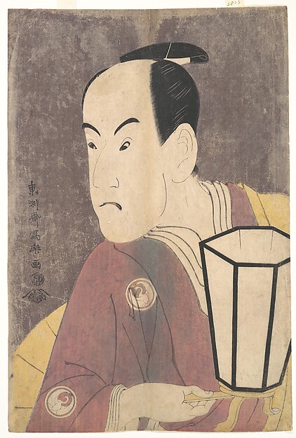
Henry L. Phillips Collection, Bequest of Henry L. Phillips, 1939 — The Metropolitan Museum of Art · Public domain (Met Open Access) (source-declared; recheck the canonical record before reuse)
第三部 · 検品
part three — the inspection
丁合の秘密
chōai no himitsu — The Secret of the Collation
Between the sheet and your hands stands the collation — the machinery that decides which cards share a pack — and it is the most secretive step in the whole line. The physics is documented by everyone except the people who do it: because pack contents descend from sheet layout, collation has repeatedly been mappable— 1994's Fallen Empires had striped patterns predictable enough to read boxes, and by early 2013 the largest Magic forum had banned box-mapping threads for "too much potential for abuse." No formal publisher statement on mapping exists in the public record we could find; the response is visible only as quietly changed collation. The transparency, where it exists, is strangely distributed. Wizards — folklorically the most secretive — is actually the only major publisher that officially publishes its pack odds, slot by slot, to the second decimal. Japan's machinery layer is more open than its publishers: one specialist printer advertises random collation of trading cards as a house specialty, and TOPPAN's corporate page lists "precision control of pull rates aligned with customer sales strategies" as a service — rarity odds as a factory deliverable, printed in a sales brochure. Meanwhile the famous god packs — all-chase packs, reported in Japanese-market product — demonstrably exist and have, as far as we could find, never once been announced first-party; the circulating rates are retailer folklore whose numbers mutate between per-pack and per-box tellings, so we print none of them here (our own odds room, Pull Rates, Honestly, keeps the figures that do carry a basis). Two closing images. The same company that has never acknowledged a paper god pack discloses a digital god-pack rate — 0.05%, per the figure collectors relay from the app's own odds screen — because app-store rules force what booster boxes never had to answer. And in 2026, TOPPAN productised paper pack-wrap that blocks 98% of light, engineered specifically against people shining torches through boosters. Anti-cheat is now part of how a card is made.
検品の門
kenpin no mon — The Inspection Gate
Factory QC is the stage nobody documents — and it is everywhere visible in negative. Misprint collectors have mapped the production chain step by step precisely because every defect class is a step's failure mode: miscuts from sheet shift in two-stage cutting, square corners from the rounding die, crimps from the heat-press that seals the pack, plate damage propagating across whole runs. The community account of Magic's pipeline notes that technical misprints are "usually caught by the printers' quality control process and the affected sheets are discarded" — meaning every escaped double-print and mis-stamped holo is the rare residue of a process that works. What no publisher publishes is the process itself: no centering tolerance, no defect classification, no inspection regime, from anyone, anywhere we looked. The de-facto public standard for acceptable manufacturing is written after the fact by grading companies — third parties grading the output. When quality does fail at scale, the documented responses are oblique. The 2023 wave of scratched and lined Scarlet & Violet holos received, as far as the public record shows, no defect acknowledgment at all; the documented official act that era was structural — three guaranteed foils in every pack, and a price rise attributed to inflation — framed as value, and incidentally fatal to pack-weighing. The nearest thing to a published QC promise in the hobby is Pokémon Japan's formal single-card exchange channel for defective cards: a remedy, without a spec. And the most honest QC documentation any publisher maintains is an apology archive — One Piece Card Game's news feed logs its misprints notice by notice, from illustrator credits in its very first set onward, each with a formal bow. The inspection gate is real. You just only ever see what it missed.
検品の来世
kenpin no raise — The Inspection's Afterlife
Here is the inversion this wing was built for: quality control does not end at the factory door — it is re-employed, at market rates, on the other side. The grading company CGC calls itself the first third-party grading service to authenticate and grade major error cards, and to do it, its senior graders got themselves invited into a North Carolina printing plant in 2021 and now consult that factory's own QC experts to authenticate the strangest escapes. The people whose job was to catch the errors now certify them. The taxonomy they published maps each collectible error to its production step: wrong backs (a German Base Set Growlithe with a Magic back, because shared printers print backs first), holo splice tape from the end of a film roll, three graded tiers of miscut — and the double-prints that are "probably make-readies," press-calibration sheets meant for destruction that escaped into boosters. Centering standards are the factory tolerance's afterlife with numbers attached: on PSA's current published ladder a "virtually perfect" Gem Mint 10 may still sit at 55/45 front and 75/25 back — visibly off-centre — and only the top labels of rival graders demand true 50/50; qualifiers like OC and MC print the factory's flaw permanently on the slab. The famous errors read like folklore because they are: the 1989 Ripken card whose rolling corrections spawned at least ten collectible variants; Summer Magic, the fixed print run recalled for destruction whose survivors became a genre; the Prerelease Raichu that its own publisher denied for years until a staff photo surfaced in 2006. And the protective ending the house cares most about: production knowledge is how collectors defend themselves. The light test reads the core; the loupe reads the rosette; graders warn that missing texture is the signature of most counterfeits — and CGC refuses an entire error class, square-cut cards, without provenance to a Wizards employee, quarantining the category to protect buyers. Protect, not discipline — the inspection's last and best job.
Where we read this 出典
Every quotation above was checked against the source named here before publication; community-documented mechanics are credited to the communities that reverse-engineered them, and where a claim rests on a job posting, an apology notice, or an absence, the text says so. Ten research dossiers fed this wing, and each one was adversarially refuted before a word of the page was written — the numbers that failed refutation are not on this page. If we've got something wrong, tell us and we'll mend it.
the design flow — first-party
- Rosewater, “Vision Design, Set Design, and Play Design” (2017) — the four stages, 20 months
- Rosewater, “Nuts & Bolts #13: Design Skeleton Revisited” (2021) — CW01 and the quotas
- Rosewater, “New World Order” (2011) — rarity as a complexity budget
- Hawley, “Play Design Lessons Learned” (2019) — the Oko post-mortem
- JDN interview with Mitsuhiro Arita — the three art gates, two months a card (Japanese)
- ComicBook.com interview with Atsushi Nagashima (2020) — set planning and the playtest team
- Bandai Namco Integrated Report 2023 — producer Kohei Goto on OPCG (Japanese, PDF)
- Next Play Inc. — works page crediting OPCG rule design
- Konami Yu-Gi-Oh! recruiting hub — the card-planner and production roles (Japanese)
- One Piece Card Game — the April 2026 restriction notice (cadence, the banned pair)
the press — printers, patents, and the object
- Cartamundi — “Magic the Gathering Cards produced by Cartamundi North America”
- TOPPAN — trading-card business page (largest-in-Japan claim, pull-rate control, light-shielding packs)
- Millennium Print Group — “a subsidiary of The Pokémon Company International”
- DNP patent JP4564381B2 — the five-layer hologram transfer foil
- MTG Wiki — Print sheet (community-assembled sheet and rarity mechanics, citing WotC)
- The Collation Project — how boosters are collated (community research)
- misprintedmtg — the ten-step production chain and its failure modes
- Rosewater, “What Are Play Boosters?” (2023) — official slot-by-slot odds
the inspection and its afterlife
- CGC Cards, “Error Card Types” — the graded error taxonomy, the factory visit
- PSA Grading Standards — the centering ladder (live 2026 wording)
- CGC Cards grading scale — Pristine 50/50 and the ladder
- Pokémon Japan — the single-card exchange guideline (Japanese)
- One Piece Card Game — the topics feed, where the apologies live
- MTG Wiki — Summer Magic; Misprint (the recall and the taxonomy)
- Bulbapedia — Prerelease Raichu; Holofoil patterns; Millennium Print Group
Nothing here was ever perfect; it was inspected, and loved anyway.